MAKE GLOVE NOT W.A.R.— Twins Jerseys.

Social media. Working from home. Streaming versus cable. Does avocado go on toast or on top of eggs.
Add one more item to what different generations disagree on: the Minnesota Twins’ new garbs for the 2023 season.
We’re less than a month away from pitchers and catchers reporting - time to stir up some controversy with the new threads.
Young boomer/old Gen X’er
I’ll start with my old friend Izzy, who may not be quite a boomer but is too old to fit in a typical Gen X. He has strong words, and I trust Izzy fully in his sports fashion takes since he believes, correctly so, that NHL teams should always wear white at home.

What doesn’t Izzy like? I reached out to him this week, only editing this to take the second space out after each period.
Said Izzy: “After forcing myself to relive the horror of seeing these eyesores of a Twins uniform, I have thoughts - single color Twins script looks cheap & minor league. The number fonts are brutal. The Minnesota Marlins...enough said. The 24 year old "designer" on the NIKE design team obviously knows nothing about the history and tradition of the Minnesota Twins because "Minny & Paul who?". Whoever greenlit this garbage should be fired (editor’s note: Izzy’s quote, not Make Glove not W.A.R.’s) The 80s Spring Training/Pre-game uniforms were better than this crap. I wonder if Bob Uecker has an extra seat because I think it's time to join him in the front row in Milwaukee.”
“Young” Gen X/Aging Millennia
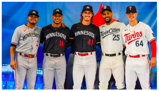
Look no further than yours truly. I’ll go left to right and we’ll finish with the lids.
Road grey pinstrips (RIP Luis Arraez’ Twijns career) - classic and my favorite. Very 1990’s-ish. Being a NY’er I haven’t always been a fan of pinstripes anywhere but at home, but they’re sharp. Ranked: 1
Road pinstrips with dark jersey - fine, I’ll say it. Dark jerseys don’t belong in MLB anywhere outside of spring training. They’re wearing these things in the playoffs now, SMH. Ranked: 4 (only because it’s followed by…)
Home whites with dark top: It’s time we finally say what all the dark jerseys at home are in every league. A complete money grab. Though I imagine the Twins would show up on the road wearing this from time to time. Not even Joe Ryan’s amazing flow can save this one. Ranked: 5
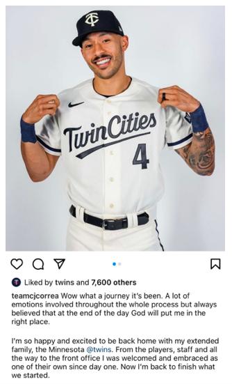
Saints style homes: I won’t lie, I originally hated this uni but maybe it’s grown on me (I’m not the only one, keep reading) because I long for Byron Buxton sauntering around CF after some fly balls for a whole summer and not by appointment only. This has angered some non metro Minnesotans by saying “Twin Cities”. Isn’t this Minnesota’s team after all? I don’t buy it, what do you think “T” and “C” stand for? And that M and StP flag on the arm is amazing. Ranked: 2
Also, if Carlos Correa decided on this jersey for his return photo, who am I to disagree?
Classic whites: The colors pop but remind me a bit of the Washington Nationals, a relatively unremarkable franchise. The font isn’t larger than on those other jerseys but it looks huge. Also, a different colored number on front and back. The red belt that Buxton and Correa teased all last year do look good on this combo. Ranked: 3
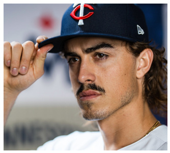
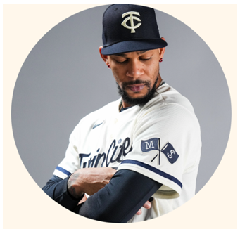
About those lids…

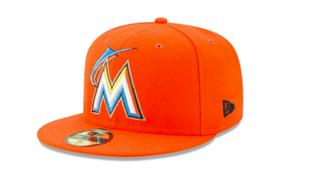
What does the M stand for anyways. Milwaukee? Miami Minigolf? An ode to Kirby’s era but just a swing and a miss. The other two hats are fine, but I just can’t get over the fake north star (I guess?) on top of the M. When we all know this state’s sports name is Winnesota, anyways.
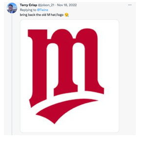
And if you’re going to bring back a solo “M”, why wouldn’t you use this?
Millennials
There was a belief that the “M” North star hat was the biggest dividing point but I’ve debunked that. Everyone hates it, even millennials who aren’t quite old enough to remember the “Kirby M” above.
I looked no further than noted millennial Twins uber fan (and Twins Daily contributor) Melissa Berman to get her point of view.
Melissa said: “I, like many fans, am not crazy about the new M hat, and it has not started to grow on me yet, either. I find it very boring and basic (editor’s note: millennial word), and immediately when I saw it, it looked like the Miami Marlins. I understand that the Marlins do not have a monopoly over the letter M, but it appeared to be the same font and everything. Fans have been clamoring for years to bring back the cursive M hat. I wish they would have just slightly updated that logo, possibly by adding a star to it. I am curious if the Twins forge ahead with this hat for perhaps decades until the next rebranding or if they take note of its unpopularity and decide to change things up again.”
But alas, it’s not unpopular with everyone (just the ones of us with fashion sense).
Millennial Catholic Priest Ryan O’Neill loves the “M”.

It seems that as a whole, Millennials like the new threads much more than the older generations. They’re not quite old enough to relive the glory days, or be complete Bitter Betties.
“When the uniforms were released in November I was a bit underwhelmed, but they have continued to grow on me since then,” Berman told Make Glove not W.A.R. “I think the white jersey is crisp and beautiful, and I love the bright red font. The jersey that I have changed my mind most on is the cream, ‘Twin Cities’ jersey. While to me it still seems like something that should be worn every once in a while on a throwback night, I am really intrigued by the team embracing Twin Cities/Minnesota pride, seeing as we are commonly overlooked on the national landscape.”
Gen Z
The short attention span generation loves options - here are five to look at on electric devices and avoid human interaction (pot calling kettle black here sorry, I agree). And words clean and tight.

I heard the Twins are thanking each Gen Z fan individually, though.
Ryan Stanzel is a PR pro and freelance content creator based in the East Metro. Follow him on Twitter or e-mail him here.